How Figures & Images work in Pelican, by default
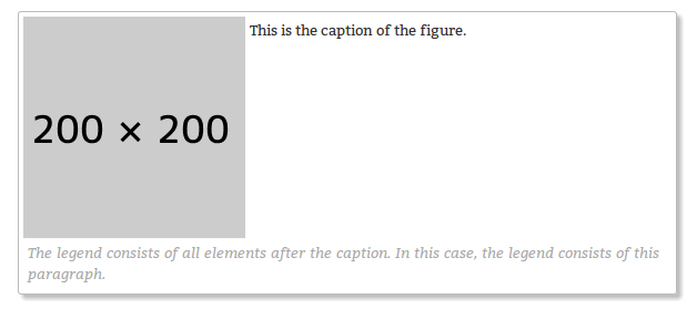
By default Pelican does a great job with figures and images, thanks to built-in support in ReStructuredText [1][1] . Pelican will turn this rst input:
.. figure:: {static}/images/better-figures-images-plugin-for-pelican/dummy-200x200.png
    :align: right

    This is the caption of the figure.

    The legend consists of all elements after the caption. In this case, the legend consists of this paragraph.
into this HTML output:
<div class="figure align-right">
    <img alt="/static/images/dummy-200x200.png" src="/static/images/dummy-200x200.png" />
    <p class="caption">This is the caption of the figure.</p>
    <div class="legend">The legend consists of all elements after the caption. In this case, the legend consists of this paragraph</div>
</div>
Which, given this CSS:
/* Styles for Figures & Images */

img {
    border: 1px solid #bbb;
    border-radius: 3px;
    padding: 4px;
    float: left;
    margin: 1em 1em 1em 0;
    box-shadow: 4px 4px 4px 0px rgba(128, 128, 128, 0.5);
}
img.align-right {
    float: right;
    margin: 1em 0 1em 1em;
}

.figure {
    border: 1px solid #bbb;
    border-radius: 3px;
    padding: 4px;
    float: left;
    margin: 0 1em 1em 0;
    box-shadow: 4px 4px 4px 0px rgba(128, 128, 128, 0.5);
}
.figure.align-right {
    float: right;
    margin: 0 0 1em 1em;
}
.figure.align-left {
    float: left;
}
.figure img {
    border: none;
    border-radius: 0;
    padding: 0;
    margin: 0;
    box-shadow: none;

    float: left;
}
.figure p.caption {
    margin: 0;
    font-size: 80%;
    padding: 4px;
    float: left;
    text-align: left;
}
.figure div.legend {
    padding: 4px;
    font-size: 80%;
    color: #aaa;
    font-style: italic;

    float: left;
}…will look something like this:
This is great, but it’s not quite what I wanted. I wanted the caption under the image and then the figure to shrink to fit the size of the image it contains. It turns out that this is impossible in HTML & CSS unless you give the browser an explicit width attribute for the img and the containing div.
If you actually do that, and add a style="width: 200px; height: auto;" attribute to both the div and the img, you get this - which is what I wanted:
This is the caption of the figure. The legend consists of all elements after the caption. In this
case, the legend consists of this paragraph. image::{static}/images/posts/better-figures-images-plugin-for-pelican/dummy-200x200.png[]
The problem with this, is that it means that you need to supply a width attribute containing the actual pixel width of the image, for each and every image you use. This would be very tedious to do by hand, so I wrote a Pelican plugin to do this, plus a couple of other related things, for me.
What the Better Figures & Images plugin does
- Adds a
style="width: ???px; height: auto;"attribute to any<img>tags in the content, by automatically checking the dimensions of the actual image file on disk and adding the appropriate attribute to the<img>tag. - Also finds any
<div class="figures">tags in the content which contain images - and adds the same style attribute to them. - If the
RESPONSIVE_IMAGESsetting is true, it addsstyle="width: ???px; max-width: 100%; height: auto;"instead. - Corrects Alt text: If an img alt attribute = the image filename, it sets it to “”
- Inserts automatic figure numbers into figure captions, if
FIGURE_NUMBERS == Truein global config, or figure_numbers exists in article metadata.
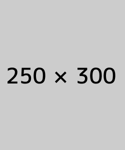
Assuming that the image is 250px wide, it turns output like this:
<div class="figure">
    <img alt="/static/images/image.jpg" src="/static/images/better-figures-images-plugin-for-pelican/image.jpg" />
    <p class="caption">
        This is the caption of the figure.
    </p>
    <div class="legend">
        Lorem ipsum dolor sit amet, consectetur adipisicing elit, sed do eiusmod tempor incididunt ut labore et dolore magna aliqua.
    </div>
</div>
into output like this:
<div class="figure" style="width: 250px; height: auto;">
    <img style="width: 250px; height: auto;" alt="" src="/static/images/image.jpg" />
    <p class="caption">
        This is the caption of the figure.
    </p>
    <div class="legend">
        Lorem ipsum dolor sit amet, consectetur adipisicing elit, sed do eiusmod tempor incididunt ut labore et dolore magna aliqua.
    </div>
</div>
or this, if RESPONSIVE_IMAGES = True:
<div class="figure" style="width: 250px; max-width: 100%; height: auto;">
    <img style="width: 250px; max-width: 100%; height: auto;" alt="" src="/static/images/image.jpg" />
    <p class="caption">
        This is the caption of the figure.
    </p>
    <div class="legend">
        Lorem ipsum dolor sit amet, consectetur adipisicing elit, sed do eiusmod tempor incididunt ut labore et dolore magna aliqua.
    </div>
</div>
or this, if FIGURE_NUMBERS is also True:
<div class="figure" style="width: 250px; max-width: 100%; height: auto;">
    <img style="width: 250px; max-width: 100%; height: auto;" alt="" src="/static/images/image.jpg" />
    <p class="caption">
        <span class="fig_num" id="fig_1">Figure 1: </span>This is the caption of the figure.
    </p>
    <div class="legend">
        Lorem ipsum dolor sit amet, consectetur adipisicing elit, sed do eiusmod
        tempor incididunt ut labore et dolore magna aliqua.
    </div>
</div>
How to use the Plugin
This plugin is now upstream in the main pelican-plugins repository, you can check that out like this:
$ git clone git@github.com:getpelican/pelican-plugins.gitIt requires BeautifulSoup and PIL/Pillow - see the readme for details on installing these.
Then add something like this to your pelican config:
# Where to look for plugins
PLUGIN_PATH = '../pelican-plugins'
# Which plugins to enable
PLUGINS = ['better_figures_and_images']
Optionally, enable the responsive stuff via the plugin, by adding this to your config:
# Setting for the better_figures_and_images plugin
RESPONSIVE_IMAGES = True
Or add something like this to your theme’s CSS:
img, div.figure { max-width: 100%; height: auto; }You can enable automatic figure numbering, by adding this to your config:
# Setting for the better_figures_and_images plugin
FIGURE_NUMBERS = True
or, to enable this on a per post basis, add this into the posts metadata:
:figure_numbers: TrueAnd that’s it - you should now have Better Figures & Images.
(Not Very) Frequently Asked Questions
What is the RESPONSIVE_IMAGES setting for?
This site uses a responsive layout - it changes its layout and column widths based on the size of the screen or window you use to view it. This means, ideally, that any images contained inside those columns would also shrink or expand to fit, when the column they’re in changes. If they don’t, the images will break out of the columns if the column becomes too narrow.
The simplest way to do this, would be to add something like this to your CSS:
img, div.figure { max-width: 100%; height: auto; }This tells the browser that images can only ever be as wide as their container - i.e. 100% of the width of their parent element. This means that when the column that the image is in shrinks - and becomes smaller than the images native width - the image will be shrunk to fit inside.
Note that this isn’t the perfect solution and isn’t fully responsive - because there isn’t a perfect solution at the moment - this provides a simple solution that gets me 80% of what I wanted: shrink to fit images that expand up to their full width (but no further) and stay inside their containers.
Couldn’t you just…
Yes, you could just add that to your CSS and only have the plugin add the width: ???px part - this would work fine. If you want to do that, either don’t set RESPONSIVE_IMAGES in your pelican config, or set it to False.
So why is there a RESPONSIVE_IMAGES setting at all?
Um… It’s partially just there because this is the way I wrote the plugin initially, before I thought it through properly.
The reason I left it in, is twofold:
- It means that you can get responsive images and figures just by using this plugin - no need to mess with your theme’s CSS if you don’t want to.
- Because there are lots of other ways to fudge responsive images and I may decide to use one of the alternatives - and at some point, presumably an official standard way to do it will arrive. So I may want to do extra processing, add extra markup, or do other things to support future responsive image techniques here, so I left that hook in so that I could easily add it.
Why are you messing with the ALT text?
By default Pelican adds a default alt attribute to images that don’t have them - and sets it to the image’s filename.
This is well meaning, but wrong.
The alt attribute is meant to provide a textual alternative to the image, for people who can’t see the image, for some reason - they might be blind, using a screen reader, they might be using a text-only browser, they might be a search engine, the image might not have loaded for some reason, etc…
Imagine that you are reading your page to someone over the phone. What would be the appropriate thing to do when you reach the image? [2] What would you say about that image if you were describing the page over the phone to someone?
If you wouldn’t mention the image at all, then explicitly set the alt attribute to an empty string:
<img alt="" src="" ... />Otherwise, set it to whatever you would have said over the phone.
Why not just leave it out? Because screen readers tend to read the filename for images that don’t have an alt attribute. This also means that you never need to set the alt attribute to the image filename - that’s already there in the src attribute, if needed.
Examples
Here are a few working examples, showing the results of using the plugin. The original rst source for these are available in the plugins /test folder:

Lorem ipsum dolor sit amet, consectetur adipisicing elit, sed do eiusmod tempor incididunt ut labore et dolore magna aliqua.

Lorem ipsum dolor sit amet, consectetur adipisicing elit, sed do eiusmod tempor incididunt ut labore et dolore magna aliqua. Ut enim ad minim veniam, quis nostrud exercitation ullamco laboris nisi ut aliquip ex ea commodo consequat. Duis aute irure dolor in reprehenderit in voluptate velit esse cillum dolore eu fugiat nulla pariatur.
Lorem ipsum dolor sit amet, consectetur adipisicing elit, sed do eiusmod tempor incididunt ut labore et dolore magna aliqua. Ut enim ad minim veniam, quis nostrud exercitation ullamco laboris nisi ut aliquip ex ea commodo consequat. Duis aute irure dolor in reprehenderit in voluptate velit esse cillum dolore eu fugiat nulla pariatur. Excepteur sint occaecat cupidatat non proident, sunt in culpa qui officia deserunt mollit anim id est laborum.
Lorem ipsum dolor sit amet, consectetur adipisicing elit, sed do eiusmod tempor incididunt ut labore et dolore magna aliqua. Ut enim ad minim veniam, quis nostrud exercitation ullamco laboris nisi ut aliquip ex ea commodo consequat. Duis aute irure dolor in reprehenderit in voluptate velit esse cillum dolore eu fugiat nulla pariatur. Excepteur sint occaecat cupidatat non proident, sunt in culpa qui officia deserunt mollit anim id est laborum.
Footnotes & References:
- The two image directives: “image” and “figure” in reStructuredText: http://docutils.sourceforge.net/docs/ref/rst/directives.html#images ↩
- Guidelines on ALT texts in IMG elements: http://www.cs.tut.fi/~jkorpela/html/alt.html http://www.456bereastreet.com/archive/200412/the_alt_and_title_attributes/ http://diveintoaccessibility.info/day_21_ignoring_spacer_images.html ↩